Imagine this.
Your company just launched a new AI-powered loan approval system.
It’s faster, more efficient, and promises to reduce risk.
But then, reports start surfacing, “The system seems to be unfairly denying loans to people from certain regions (based on the zipcodes/pincodes)”
Panic sets in.
Is your AI biased?
How do you find out?
And more importantly, how do you fix it?
This scenario highlights a growing challenge in the world of AI: the need for explainability.
As AI systems become increasingly complex and integrated into critical business processes, understanding their inner workings is no longer a luxury, it’s a necessity.
Enter Explainable AI (XAI), your AI detective, here to shed light on those “black box” algorithms and help you understand the “why” behind the “what”.
XAI is all about making AI more transparent, trustworthy, and fair.
Why is XAI Your New Best Friend?
In a world where AI is making decisions that impact people’s lives and livelihoods, trust is paramount.
XAI helps us achieve that trust by:
- Building Confidence: Knowing how AI works makes us more comfortable relying on its decisions.
- Ensuring Fairness: XAI helps us identify and mitigate biases, ensuring everyone gets a fair shot.
- Promoting Accountability: XAI helps us understand who’s responsible when AI makes a mistake.
- Simplifying Debugging: XAI makes it easier to find and fix errors in AI models.
- Meeting Regulatory Requirements: XAI helps companies comply with transparency regulations.
XAI’s Toolkit: Cracking the Code of AI
XAI comes equipped with a variety of tools to help us understand AI’s decision-making process:
-
LIME (Local Interpretable Model-agnostic Explanations): LIME acts like a magnifying glass, zooming in on individual predictions and showing how each factor contributed.
It’s like asking, “Why did the AI reject this loan application?” and LIME points to specific factors like credit history and income.
-
SHAP (SHapley Additive exPlanations): SHAP is the team player, analyzing how different factors work together to influence the final decision.
It assigns each factor a score based on its contribution.
Think of it as analyzing a basketball game and seeing how much each player contributed to the win, from the star scorer to the defensive specialist.
-
Counterfactual Explanations: These are the “what if” scenarios of XAI.
They tell us how things would need to change to get a different outcome.
For example, “If the applicant’s income was $10,000 higher, the loan would have been approved.”
This helps us understand the AI’s decision-making logic and identify areas for improvement.
-
Decision Trees and Rule-Based Models: These are the most straightforward AI models.
They make decisions based on a clear set of rules, like a flowchart.
It’s easy to follow the logic and understand why a particular decision was made.
Let’s Get Our Hands Dirty with Code!
Let’s take a general example to demonstrate the use of two of the above tools of XAI – LIME and SHAP.
LIME in Python
Objective: To understand why the Random Forest model predicted a specific type of iris flower for the 100th data point in the dataset.
import lime
import lime.lime_tabular
from sklearn.datasets import load_iris
from sklearn.ensemble import RandomForestClassifier

# Load the Iris dataset (a classic dataset for classification)
iris = load_iris()
X = iris.data  # Features (sepal length, sepal width, petal length, petal width)
y = iris.target  # Target variable (type of iris flower)

# Train a Random Forest classifier (a powerful machine learning model)
rf = RandomForestClassifier(random_state=42)
rf.fit(X, y)

# Create a LIME explainer
explainer = lime.lime_tabular.LimeTabularExplainer(
    X,
    feature_names=iris.feature_names,  # Names of the features
    class_names=iris.target_names,  # Names of the target classes
    discretize_continuous=True  # Discretize continuous features for easier interpretation
)

# Explain a prediction (let's say we want to explain the 100th data point)
i = 100
exp = explainer.explain_instance(
    X[i],  # The data point we want to explain
    rf.predict_proba,  # The prediction function of our model
    num_features=4,  # Number of features to include in the explanation
    top_labels=1  # Number of top labels to explain
)

# Show the explanation in a Jupyter Notebook
exp.show_in_notebook(show_table=True, show_all=False)
How the code achieves the above objective:
- Loads the Iris dataset: This gives us the data to work with.
- Trains a Random Forest model: This gives us an AI model to explain.
- Creates a LIME explainer: This sets up LIME to work with our data and model.
- Explains a specific prediction: This tells LIME to focus on the 100th data point.
- Shows the explanation: This visualizes the results, showing how each feature (sepal length, etc.) contributed to the prediction.
Output:

SHAP in Python: A Deeper Dive with Two Perspectives
Now, let’s explore SHAP (SHapley Additive exPlanations), another powerful XAI tool.
We’ll use SHAP to analyze our XGBoost model from two different angles:
1. Simplifying to Binary Classification
First, we’ll simplify the Iris dataset problem to a binary classification task.
Instead of predicting all three iris species, we’ll focus on whether a flower is “setosa” (class 0) or not.
import shap
import xgboost
from sklearn.model_selection import train_test_split
from sklearn.datasets import load_iris

# Load the Iris dataset
iris = load_iris()
X = iris.data
y = iris.target

# Split data into training and testing sets
X_train, X_test, y_train, y_test = train_test_split(X, y, test_size=0.2, random_state=42)

# Train an XGBoost model with a binary classification objective (adjusting for Iris data)
model = xgboost.XGBClassifier(objective="binary:logistic", random_state=42)

# For this example, let's simplify and predict if a flower is setosa (class 0) or not
y_train_binary = (y_train == 0).astype(int)
y_test_binary = (y_test == 0).astype(int)
model.fit(X_train, y_train_binary)

# Explain the model's predictions using SHAP values
explainer = shap.Explainer(model)
shap_values = explainer(X_test)

# Visualize the SHAP values (now for a single output)
shap.plots.beeswarm(shap_values)
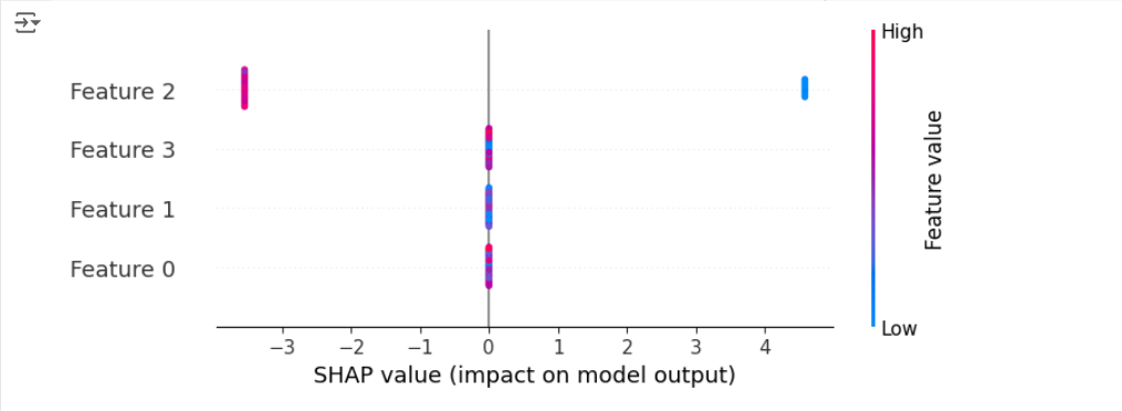
This code trains an XGBoost model specifically for binary classification (objective="binary:logistic") and then calculates SHAP values.
The resulting beeswarm plot shows how each feature contributes to the model’s ability to distinguish “setosa” from the other two classes combined.
Output:

2. Focusing on a Specific Class in a Multi-Class Setting
Next, let’s keep the multi-class nature of the Iris dataset but use SHAP to focus our explanation on a single class.
We’ll analyze how the model predicts “setosa” in the context of all three classes.
import shap
import xgboost
from sklearn.model_selection import train_test_split
from sklearn.datasets import load_iris

# Load the Iris dataset
iris = load_iris()
X = iris.data
y = iris.target

# Split data into training and testing sets
X_train, X_test, y_train, y_test = train_test_split(X, y, test_size=0.2, random_state=42)

# Train an XGBoost model
model = xgboost.XGBClassifier(objective="multi:softprob", random_state=42)
model.fit(X_train, y_train)

# Explain the model's predictions using SHAP values
explainer = shap.Explainer(model)
shap_values = explainer(X_test)

# Select SHAP values for a specific class (e.g., class 0)
shap_values_class0 = shap_values[:, :, 0]

# Visualize the SHAP values for the selected class
shap.plots.beeswarm(shap_values_class0)
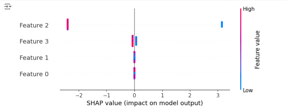
This code trains an XGBoost model for multi-class classification (objective="multi:softprob") and then extracts the SHAP values specifically for the “setosa” class.
The beeswarm plot now shows how each feature contributes to predicting “setosa” in relation to “versicolor” and “virginica.”
Output:

Comparing the Two Approaches
These two approaches provide different perspectives on the model’s behavior:
- The first approach simplifies the problem to binary classification, giving us a general understanding of how the model separates “setosa” from the other classes.
- The second approach retains the multi-class complexity and provides a more granular view of how the model specifically predicts “setosa.”
The choice of approach depends on your XAI goals.
If you want a general understanding of class separation, the first approach is suitable.
If you need a detailed understanding of how the model predicts a particular class, the second approach is more appropriate.
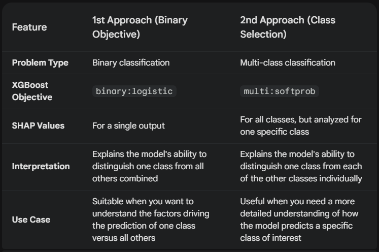
Here’s a detailed Comparison and Contrast of the above approaches:

By using SHAP with these two approaches, we gain a comprehensive understanding of how our XGBoost model predicts iris species.
It highlights the importance of different features and their impact on the model’s decisions.
XAI in Action: Saving Lives and Building Trust
Let’s say a hospital uses AI to predict patient readmission risk.
XAI can help doctors understand why the AI flagged a particular patient as high-risk.
Perhaps it’s a combination of age, medical history, and recent lab results.
This allows doctors to validate the AI’s assessment, personalize treatment plans, and potentially prevent unnecessary readmissions.
It also fosters trust between doctors and the AI system, leading to better patient outcomes.
Now, let’s see how we can apply LIME and SHAP to our hospital readmission risk example.
LIME for Explaining Individual Predictions
import pandas as pd
import lime
import lime.lime_tabular
from sklearn.preprocessing import OneHotEncoder
from sklearn.ensemble import RandomForestClassifier
from sklearn.model_selection import train_test_split


# Create a dictionary with dummy patient data which includes the following features:
# 'age', 'gender', 'heart_condition', 'diabetes', 'blood_pressure',
# 'cancer_condition', 'lab_result_1', 'lab_result_2', 'readmission'
# In this dataset, the target variable is 'readmission'
# It has two values (1 for readmission, 0 for no readmission)
data = {
    'age': [65, 72, 58, 49, 81, 68, 70, 55, 62, 50, 78, 63, 59, 45, 85, 71, 69, 52, 60, 48, 75, 61, 57, 42, 83],
    'gender': ['M', 'F', 'F', 'M', 'M', 'F', 'M', 'F', 'M', 'F', 'M', 'F', 'M', 'F', 'F', 'M', 'F', 'M', 'F', 'M', 'F', 'M', 'F', 'M', 'F'],
    'heart_condition': [1, 0, 1, 0, 1, 0, 0, 1, 0, 1, 0, 1, 0, 1, 0, 0, 1, 0, 1, 0, 1, 0, 1, 0, 0],
    'diabetes': [0, 1, 0, 0, 1, 1, 0, 0, 1, 0, 1, 0, 0, 1, 1, 0, 0, 1, 0, 1, 0, 0, 1, 1, 0],
    'cancer_condition': [0, 0, 1, 0, 0, 1, 0, 0, 1, 0, 0, 1, 0, 0, 1, 0, 0, 1, 0, 0, 1, 0, 0, 1, 0],
    'blood_pressure': [140, 120, 160, 130, 150, 135, 125, 145, 138, 142, 118, 155, 132, 148, 128, 137, 122, 158, 130, 145, 125, 139, 120, 160, 135],
    'lab_result_1': [10.5, 8.2, 12.1, 9.3, 11.8, 9.9, 8.5, 10.2, 11.5, 10.8, 8.0, 12.5, 9.1, 11.6, 9.7, 8.3, 10.0, 11.3, 10.6, 8.1, 12.3, 9.0, 11.4, 9.5, 8.4],
    'lab_result_2': [5.2, 4.5, 6.3, 4.8, 5.9, 5.5, 4.9, 5.1, 6.1, 5.0, 4.3, 6.5, 4.7, 5.8, 5.3, 4.7, 5.0, 6.0, 5.4, 4.6, 6.2, 4.9, 5.7, 5.2, 4.8],
    'readmission': [1, 0, 1, 0, 1, 0, 0, 1, 0, 1, 0, 1, 0, 1, 0, 0, 1, 0, 1, 0, 0, 1, 0, 1, 0]
}

# Create a pandas DataFrame from the data
patient_data = pd.DataFrame(data)

print(patient_data)


# Prepare the data
X = patient_data.drop('readmission', axis=1)
y = patient_data['readmission']

# One-hot Encode categorical features
encoder = OneHotEncoder(handle_unknown='ignore')  # Create an encoder object
X_encoded = encoder.fit_transform(X[['gender']])  # Encode the 'gender' column

# Create a new DataFrame with the encoded features
X_encoded_df = pd.DataFrame(X_encoded.toarray(), columns=encoder.get_feature_names_out(['gender']))
X = pd.concat([X.drop('gender', axis=1), X_encoded_df], axis=1)  # Concatenate with original data

# Get feature names (important for LIME)
feature_names = X.columns.tolist()

# Split data into training and testing sets
X_train, X_test, y_train, y_test = train_test_split(X, y, test_size=0.2, random_state=42)

# Train a model (e.g., Random Forest)
model = RandomForestClassifier(random_state=42)
model.fit(X_train, y_train)

# Create a LIME explainer
explainer = lime.lime_tabular.LimeTabularExplainer( X_train.values, feature_names=feature_names, class_names=['No Readmission', 'Readmission'], discretize_continuous=True )

# Explain a prediction (e.g., for the first patient in the test set)
patient_index = 0
exp = explainer.explain_instance( X_test.iloc[patient_index].values, model.predict_proba, num_features=5, top_labels=1 )

# Visualize the explanation
exp.show_in_notebook(show_table=True, show_all=False)
This code snippet first prepares the patient data, then trains a Random Forest model to predict readmission.
Next, it creates a LIME explainer object.
We then use this explainer to understand the model’s prediction for a specific patient.
LIME will highlight the key features (e.g., age, certain blood test results, a specific medical condition) that most influenced the model’s prediction for that individual.
Output:

SHAP for Global Feature Importance
import shap
import xgboost

# (Using the same patient_data, X_train, and y_train as above)

# Train an XGBoost model
model = xgboost.XGBClassifier(objective="binary:logistic", random_state=42)
model.fit(X_train, y_train)

# Explain the model's predictions using SHAP values
explainer = shap.Explainer(model)
shap_values = explainer(X_test)

# Visualize global feature importance
shap.plots.beeswarm(shap_values)
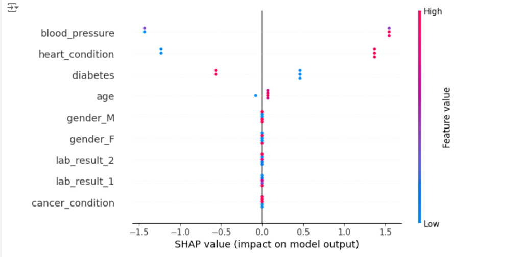
This code uses SHAP to analyze an XGBoost model trained on the same patient data.
SHAP calculates the contribution of each feature to the model’s predictions across all patients.
By visualizing these SHAP values (for example, using a bee swarm plot), we can identify the features that generally have the biggest impact on readmission risk predictions.
This gives doctors a broader understanding of the factors driving the model’s decisions.
Output:

Note that the above code for SHAP analysis aligns with the 1st approach we discussed earlier (for the Iris example).
Here’s why:
-
objective="binary:logistic": We are using the XGBoost classifier with thebinary:logisticobjective function.
This explicitly tells XGBoost to treat the problem as a binary classification task, where the model predicts the probability of a single outcome (in this case, readmission vs. no readmission). -
SHAP values for a single output: Since our XGBoost model is configured for binary classification, the resulting SHAP values will be for a single output.
The beeswarm plot then shows how each feature contributes to pushing the prediction towards “readmission” or “no readmission.”
Therefore, the interpretation of the plot is similar to the 1st approach in the Iris example discussed above.
- It shows the global feature importance for predicting readmission.
- It highlights which features have the strongest influence on the model’s predictions for readmission vs. no readmission.
- It allows us to see how different feature values affect the model’s output.
In the patient_data example we created, the “readmission” column only has two values (0 for no readmission and 1 for readmission). This makes it a binary classification problem.
The 2nd approach for SHAP analysis, where we select a specific class within a multi-class setting, wouldn’t be applicable here because there aren’t multiple levels of readmission risk to choose from.
The 2nd approach would be relevant if, for instance, we had a “readmission_risk” column with categories like:
- Low risk
- Medium risk
- High risk
In that case, we could train a multi-class classification model and then use SHAP to explain the factors driving the prediction for a specific risk level, such as “high risk.”
Keep in mind that the specific insights you gain from the plot will depend on the nature of your patient_data and the relationships between the features and readmission risk.
Important Considerations:
- This is a very simplified example.
In a real-world scenario, you would likely have many more features and a much larger dataset. - You can modify this dummy data to experiment with different scenarios and see how LIME and SHAP explanations change.
- Remember to replace this dummy data with your actual patient data when applying XAI in a real healthcare setting.
- Data Privacy: Always prioritize patient privacy and ensure compliance with regulations like HIPAA (in US), PIPEDA (in Canada), GDPR (in EU), DISHA (In India), PDAP (in Singapore), etc.).
- Feature Engineering: Work with healthcare professionals to create clinically relevant features.
- Model Selection: Consider simpler models if interpretability is paramount.
By integrating XAI techniques like LIME and SHAP into healthcare AI systems, we can empower doctors with valuable insights, build trust in AI, and ultimately improve patient care.
Conclusion
XAI is a crucial step towards building trust and ensuring fairness in AI systems.
By making AI models more transparent and interpretable, we can unlock their full potential while mitigating the risks associated with their opacity.
As AI continues to permeate various aspects of our lives, XAI will play an increasingly important role in ensuring its responsible and ethical use.
References for further reading and exploration
For those of you keen on diving deep, there’s a growing body of literature on XAI, ranging from introductory texts to in-depth research papers.
Here are some highly recommended resources:
Books:
Some of the well-known books on the topic are mentioned on the website https://www.xaifoundation.org/books. These include:
-
Interpretable Machine Learning: A Guide for Making Black Box Models Explainable by Christoph Molnar.
-
Explainable AI: Interpreting, Explaining and Visualizing Deep Learning (edited by Wojciech Samek, Grégoire Montavon, Klaus-Robert Müller, Sebastian Lapuschkin, Lars Kai Hansen).
-
Human Compatible: AI and the Problem of Control by Stuart Russell.
-
The AI Delusion by Gary Smith.
-
AI Ethics (The MIT Press Essential Knowledge series) by Markus Christen, Andreas Huppenkothen, and Bernhard Nebel.
Papers:
-
“Why Should I Trust You?”: Explaining the Predictions of Any Classifier by Marco Tulio Ribeiro, Sameer Singh, and Carlos Guestrin: This paper introduces LIME, a popular model-agnostic explanation technique (www.theregister.com).
- Why it’s good: It clearly explains the motivation and methodology behind LIME, with illustrative examples and experimental results.
-
A Unified Approach to Interpreting Model Predictions by Scott M. Lundberg and Su-In Lee: This paper presents SHAP, a game-theoretic approach to explainable AI that provides a unified framework for interpreting model predictions (NIPS papers).
- Why it’s good: It provides a strong theoretical foundation for SHAP and demonstrates its effectiveness across various models and datasets.
-
Counterfactual Explanations without Opening the Black Box: Automated Decisions and the GDPR by Sandra Wachter, Brent Mittelstadt, and Chris Russell: This paper explores the use of counterfactual explanations for legal compliance and individual recourse in the context of the General Data Protection Regulation (GDPR) (www.kdnuggets.com).
- Why it’s good: It highlights the practical applications of XAI in addressing legal and ethical concerns related to automated decision-making.
Online Resources:
- The XAI Foundation: This website provides a wealth of information on XAI, including tutorials, articles, and a comprehensive list of XAI tools and resources.
- Towards Data Science: This online publication features numerous articles and blog posts on XAI, covering a wide range of topics and techniques.
By exploring these resources, you can gain a deeper understanding of XAI and its role in building trust, ensuring fairness, and promoting responsible AI development.
