by Chaitanya | Sep 9, 2024 | Data Analytics

Introduction
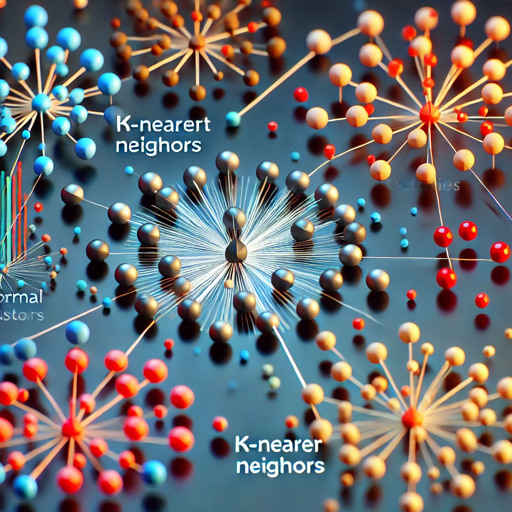
In today’s data-driven world, anomalies – those unusual data points that deviate significantly from the norm – can be indicators of fraud, system failures, or even groundbreaking discoveries.
But how can we effectively identify these anomalies amidst massive datasets?
Enter the k-Nearest Neighbors (KNN) algorithm, a versatile tool that’s gaining traction in the field of anomaly detection.
(more…)
by Chaitanya | Sep 12, 2023 | Data Analytics
Hey there, data explorers! 📊 Have you ever wondered what secrets your data holds beyond the usual suspects like mean and standard deviation? Well, it’s time to shine the spotlight on a lesser-known but equally fascinating statistic: Kurtosis. It’s like the hidden gem of data analysis, revealing the intriguing stories lurking within your datasets. Kurtosis isn’t just about dry numbers; it’s the Sherlock Holmes of statistics, helping us uncover the mysteries of data distributions. In this blog post, we’re going to embark on a journey to demystify kurtosis. We’ll unravel what kurtosis is, the different types it comes in, and how to calculate it using R. But wait, there’s more! We’ll also delve into the world of kurtosis plots, visualizing data like never before. So, if you’re ready to go beyond the basics and explore the thrilling world of kurtosis, fasten your seatbelts. We’re about to dive into the heart of data distribution and uncover the stories that numbers can tell. Let’s get started! 🚀
What Is Kurtosis?
Kurtosis is a statistical measure that describes the shape of the probability distribution of a dataset. It quantifies the “tailedness” or the thickness of the tails and the peakedness of the distribution. In essence, kurtosis tells us how much data is in the tails compared to the center of the distribution.
Types of Kurtosis
Kurtosis comes in three main flavors:
- Mesokurtic: This is the baseline kurtosis and occurs when the data distribution exhibits the same tail behavior as a normal distribution.It has a kurtosis value (usually denoted by the symbol ‘k’) of 0. This tells you that you are looking at a distribution with average tail thickness.
- Leptokurtic: A leptokurtic distribution has positive kurtosis (k > 0).You’re now looking at a distribution that has heavier tails and a sharper peak compared to a normal distribution. This tells you that there’s a higher likelihood of extreme values or outliers.
- Platykurtic: A platykurtic distribution has negative kurtosis (k < 0).Just the opposite of what you’d expect from the previous Leptokurtic distribution. That means it has lighter tails and a flatter peak than a normal distribution. Such distributions indicate that you have a lower likelihood of extreme values.
How to Calculate Kurtosis
Here’s the formula to calculate the kurtosis of a given sample of data.
Kurtosis = (Σ(xi - x̄)^4 / n) / s^4
where:
-
- Σ represents the summation symbol (sum of all values)
- xi is each individual data point
- x̄ is the sample mean
- n is the number of data points
- s is the sample standard deviation
How to Calculate Kurtosis using R programming language
Want to calculate the Kurtosis of a distribution? Well, here are two of the common methods in R that you can use:
1. Using the ‘Kurtosis’ Function from the ‘Moments’ Package
In R, you can use the kurtosis function from the moments package to calculate excess kurtosis, which measures the kurtosis relative to a normal distribution. The above package applies the following formula to give you the Kurtosis value:
Excess Kurtosis = (M4 / M2^2) - 3
Where M4 is the fourth moment and M2 is the second moment (variance) of the data. The kurtosis function computes these moments and then applies the formula to calculate excess kurtosis. By subtracting 3 from the result, it provides a measure of kurtosis relative to a normal distribution. A value of 0 indicates that the distribution has the same kurtosis as a normal distribution (mesokurtic). On the other hand, positive values indicate heavier tails (leptokurtic), and negative values indicate lighter tails (platykurtic). Here’s how you can use the kurtosis function:
R code
library(moments)
install.packages("moments")
library(moments)
data <- c(12, 15, 18, 22, 25, 28, 31, 35, 38, 41)
excess_kurtosis <- kurtosis(data)
print(excess_kurtosis)
In the above code, you can replace the data vector with your own dataset to obtain the Kurtosis value of your dataset.
Here’s the output you will get from the above sample data:

The above result is the excess kurtosis value. It is a measure of how the kurtosis of your data (in this case, the above sample data) differs from that of a normal distribution.
2. Direct Calculation
There’s another way you can calculate kurtosis. And that’s by directly using the formula:
Kurtosis = (Σ(xi - x̄)^4 / n) / s^4
Where xi represents each individual data point, x̄ is the sample mean, n is the number of data points, and s is the sample standard deviation.
R code
data <- c(12, 15, 18, 22, 25, 28, 31, 35, 38, 41)
mean_data <- mean(data)
sd_data <- sd(data)
n <- length(data)
kurt <- sum((data - mean_data)^4) / (n * sd_data^4)
print(kurt)
In the above code, you can replace the data vector with your own dataset to obtain the Kurtosis value of your dataset.
Here’s the output you will get from the above sample data:

Why the hell, are the above two results different??
Well, if you get different results using the above methods, don’t press the panic button!! The reason you might obtain different results when calculating kurtosis using the kurtosis function from the moments package and the direct calculation is due to the different formulas and definitions of kurtosis used by these methods. Here’s what it means.
- Using the
kurtosis function from the moments package:
-
- The
kurtosis function from the moments package calculates what is known as “sample excess kurtosis.”This means it calculates the kurtosis of your data relative to a normal distribution.It subtracts 3 from the kurtosis value to obtain excess kurtosis, so a normal distribution has a kurtosis of 0 (mesokurtic).Positive values indicate leptokurtic distributions (heavier tails), and negative values indicate platykurtic distributions (lighter tails).
- Direct Calculation:
-
- The direct calculation of kurtosis using the formula provided above, calculates the “sample kurtosis” without subtracting 3.This means it measures the kurtosis of your data as it is, without reference to a normal distribution.As a result, this method can yield different values than the
kurtosis function, especially if your data deviates from a normal distribution.
Which method should you use then??
Well, it depends on what you want to measure:
- If you want to assess how your data’s kurtosis compares to a normal distribution, you may prefer the
kurtosis function from the moments package. Because it provides excess kurtosis values.
- On the other hand, if you want to calculate kurtosis in its original form without reference to normality, the direct calculation is more appropriate.
It’s important that you choose the method that aligns with your specific analytical goals and how you want to interpret kurtosis in your data. Also, ensure that you’re using the same method consistently when comparing and analyzing datasets or results.
How to interpret the Kurtosis values
Well, it’s pretty simple! In general,
- High positive kurtosis ( typically, kurtosis values above 3 ) suggests that data has fat tails and is more prone to extreme values.
- Low negative kurtosis ( typically, kurtosis values below (-3) ) suggests that data has thin tails and is less prone to extreme values.
- A value of zero indicates that the data has a similar tail behavior as a normal distribution.
Now, it’s important for you to note that while the above ranges are commonly used as guidelines, the interpretation of kurtosis should also consider the specific context and domain of the data. Additionally, know that different statistical software or methods may yield slightly different ranges for categorizing kurtosis.
Visualizing Kurtosis
Kurtosis Plots
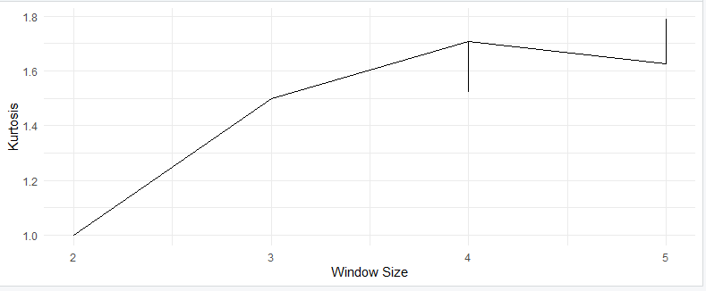
Kurtosis plots are also known as kurtograms. They provide a visual representation of how kurtosis changes with different window sizes in time series or signal data. To create a kurtosis plot in R, you can use the following code:
R code
library(moments) and library(ggplot2)
install.packages("moments")
library(moments) # For kurtosis calculation
install.packages("ggplot2")
library(ggplot2) # For creating the plot
data <- c(12, 15, 18, 22, 25, 28, 31, 35, 38, 41)
calculate_kurtosis <- function(data, window_size)
{

kurtosis_values <- numeric(length(data) - window_size + 1)
for (i in 1:(length(data) - window_size + 1))
{

window <- data[i:(i + window_size - 1)]

kurtosis_values[i] <- kurtosis(window)

}
           return(kurtosis_values)

}
window_sizes <- 2:5
kurtosis_data <- lapply(window_sizes, function(window_size)
{

kurtosis_values <- calculate_kurtosis(data, window_size)
  data.frame(WindowSize = rep(window_size, length(kurtosis_values)),

Kurtosis = kurtosis_values)

})
kurtosis_data <- do.call(rbind, kurtosis_data)
ggplot(kurtosis_data, aes(x = WindowSize, y = Kurtosis)) +

geom_line() +

labs(x = "Window Size", y = "Kurtosis") +

theme_minimal()
This code generates a kurtosis plot that allows you to visualize how kurtosis changes with different window sizes in your time series data.
Here’s the output you will get from the code:
How to generate Different Types of Kurtosis Curves
Now, let’s explore how to generate different types of kurtosis curves in R. For this, we’ll use probability distribution functions that exhibit these behaviors.
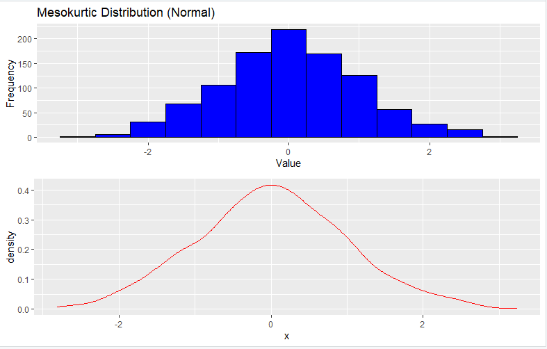
1. Mesokurtic Distribution (Normal)
To generate a Mesokurtic distribution, you can use the rnorm function, which generates random numbers from a normal distribution:
R code
set.seed(123)
n <- 1000
mean_val <- 0
sd_val <- 1
data <- rnorm(n, mean = mean_val, sd = sd_val)
library(ggplot2)
p <- ggplot(data.frame(x = data), aes(x)) +

geom_histogram(binwidth = 0.5, fill = "blue", color = "black") +

labs(x = "Value", y = "Frequency") +

ggtitle("Mesokurtic Distribution (Normal)")
density <- ggplot(data.frame(x = data), aes(x)) +

geom_density(color = "red")
library(gridExtra)
grid.arrange(p, density, ncol = 1)
Here’s the output you will get from the code:

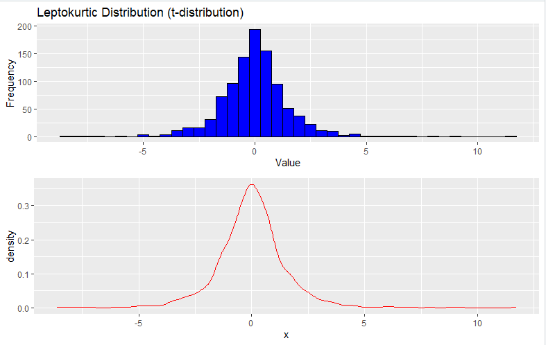
2. Leptokurtic Distribution (t-Distribution)
To generate a Leptokurtic distribution, you can use the rt function to generate random data from a t-distribution with low degrees of freedom:
R code
set.seed(123)
n <- 1000
df <- 3
data <- rt(n, df)
library(ggplot2)
histogram_plot <- ggplot(data.frame(x = data), aes(x)) +

geom_histogram(binwidth = 0.5, fill = "blue", color = "black") +

labs(x = "Value", y = "Frequency") +

ggtitle("Leptokurtic Distribution (t-distribution)")
density_plot <- ggplot(data.frame(x = data), aes(x)) +

geom_density(color = "red")
library(gridExtra)
grid.arrange(histogram_plot, density_plot, ncol = 1)
Here’s the output you will get from the code:

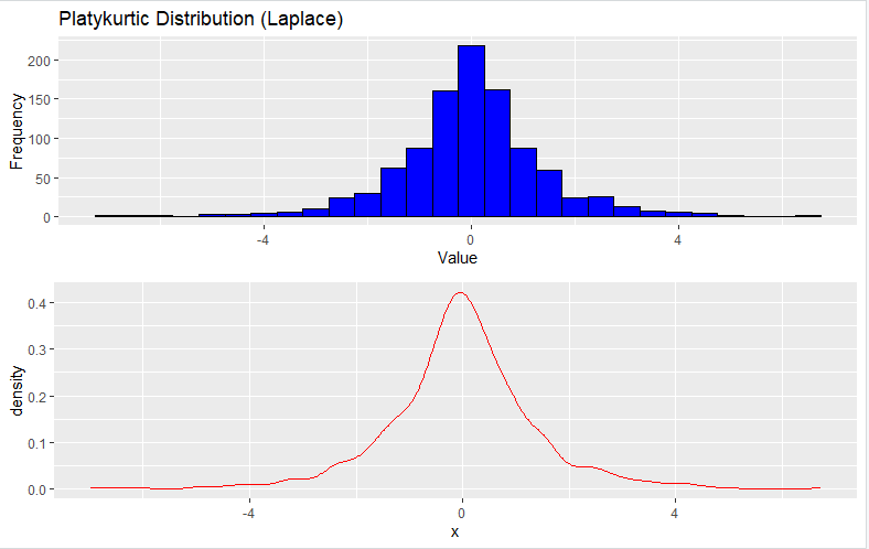
3. Platykurtic Distribution (Laplace Distribution)
To generate a Platykurtic distribution, you can use the rlaplace function to generate random data from a Laplace distribution:
R code
library(LaplacesDemon)
library(ggplot2)
set.seed(123)
n <- 1000
data <- rlaplace(n, 0, 1)
histogram_plot <- ggplot(data.frame(x = data), aes(x)) +

geom_histogram(binwidth = 0.5, fill = "blue", color = "black") +

labs(x = "Value", y = "Frequency") +

ggtitle("Platykurtic Distribution (Laplace)")
density_plot <- ggplot(data.frame(x = data), aes(x)) +

geom_density(color = "red")
library(gridExtra)
grid.arrange(histogram_plot, density_plot, ncol = 1)
Here’s the output you will get from the code:
Practical Applications of Kurtosis
Kurtosis has several practical applications in data analysis and statistics. A few of them are listed below:
- Risk Assessment in Finance: Kurtosis helps assess the risk and volatility of financial assets. Assets with high kurtosis are riskier due to more significant price swings.
- Data Transformation: It helps decide whether data needs to be transformed to approximate a normal distribution. Log or Box-Cox transformations are often applied.
- Data Ethics and Privacy: In data science, understanding kurtosis aids in handling sensitive data responsibly.
Conclusion: Unmasking the Secrets of Data’s Silhouette
In the intricate world of data, where numbers dance and patterns emerge, kurtosis is like the master storyteller who reveals the hidden tales within. It’s not just another statistic; it’s the torchbearer guiding us through the labyrinthine shapes of data distributions. With kurtosis by your side, you become the detective of data, distinguishing between the suave and the eccentric. It whispers the secrets of normalcy, heavy tails, and light tails, giving your data its very own personality. From the bustling floors of finance to the serene landscapes of data analysis, kurtosis stands as a trusty companion in your statistical odyssey. It’s the key to unraveling the mysteries, the secret sauce in your data science recipe, and the compass that keeps you on course in the wild terrain of probability distributions. So, as you embark on your data-driven adventures, remember that kurtosis is your ally—a beacon of insight in the twilight realm of data’s silhouette.
by Chaitanya | Sep 8, 2023 | Uncategorized
You know, R is a very popular programming language for data analysis and statistical computing.
One of the key features of R that attracts the Data analysts and machine learning geeks is its vast collection of packages.
Packages are nothing but, collections of functions, data, and other objects.
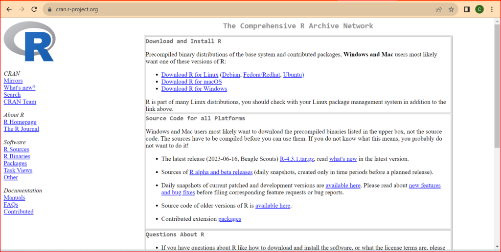
They are created and maintained by developers from around the world and are available for download from the Comprehensive R Archive Network (CRAN).
Well, you may ask
Why do we need Packages
Well, R itself has a rich set of built-in functions, which do not require installing any packages.
However, it can be limited when it comes to performing specialized tasks.
And that’s where the various packages come in.
For example, let’s say you want to create a data visualization.
R has some built-in functions for this task.
Some of these are:
plot(): for creating various types of plotshist(): for creating histogramsbarplot(): for creating bar chartsboxplot(): for creating box plotspie(): for creating pie chartsmean(): for calculating the mean of a vector of numberssd(): for calculating the standard deviation of a vector of numbersvar(): for calculating the variance of a vector of numberscor(): for calculating the correlation between two vectors of numberslm(): for fitting linear modelst.test(): for performing t-tests
These functions are part of the base R language.
You can use them without installing any additional packages.
But, what if you are interested in creating complex visualizations?!
Well, then it can sometimes take a hell lot of your time, if you restrict yourself to the above base functions only.
But, by using the ggplot2 package, you can create high-quality visualizations quickly and easily.
So, in a nutshell, by using packages, you can extend R’s capabilities to tackle a wide range of data analysis tasks.
How can you access these Packages
Well, you can access any of the thousands of packages available on the CRAN website https://cran.r-project.org/

There is another way also for accessing the above packages,
And that is, by directly accessing the link
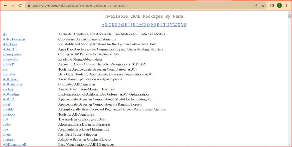
https://cran.r-project.org/web/packages/available_packages_by_name.html
Here’s a sample list of the various packages that you can use for your Data Analytics and ML requirements.

With the help of these packages, you can easily augment the functionality of R to tackle a wide range of data analysis tasks.
In this beginner’s guide, we will walk you through the process of installing and loading packages in R.
Installing Packages
To install a package in R, you can use the install.packages() function. For example, let’s say you want to install the ggplot2 package, which is a popular package for creating data visualizations.
You would run the following code in your R console:
install.packages("ggplot2")
This command will download the ggplot2 package from CRAN and install it on your system.
Remember, you only need to install a package once.
After that, you can load it whenever you need it.
Loading Packages
To use a package in R, you need to load it into your working environment.
This is done using the library() function.
For example, to load the ggplot2 package, you would run the following code:
library(ggplot2)
This command makes all the functions and data in the ggplot2 package available for use in your R code.
Conclusion
Installing and loading packages is an essential aspect of working with R.
With the vast collection of packages available, you can extend the capabilities of R to tackle a wide range of data analysis tasks.
By following this beginner’s guide, you should now have a good understanding of how to install and load packages in R.
We hope this guide helps you get started with working with packages in R.
Happy coding!
